Jakob Chychrun knows his fashion. At the NHL player media tour in Chicago, he wore Gucci loafers with a roaring tiger and a pair of stark white Valentino sneakers with an “Arizona red” streak on them. “Fashion is something I definitely enjoy. You can show a little different side of you sometimes,” the Arizona Coyotes defenseman said.
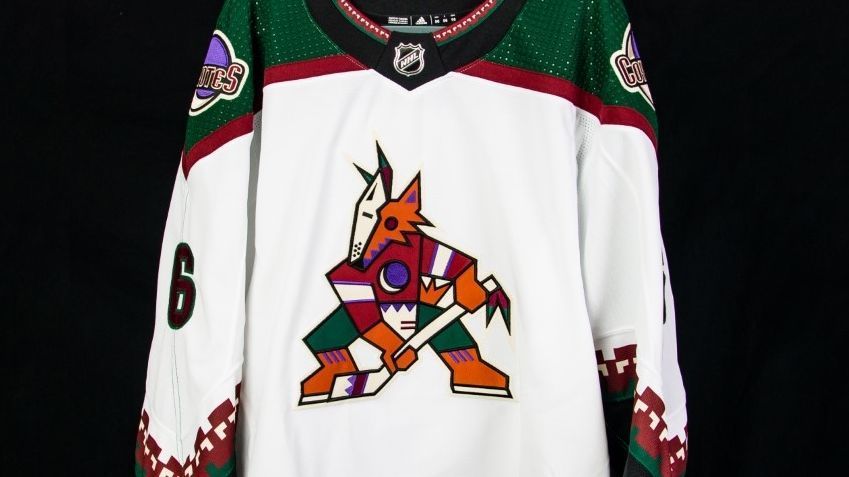
It’s said that clothes make the man, and Chychrun hopes they can also remake a franchise. His team is embarking on what it is calling a “complete rebrand and business transformation” this season. That starts with the Coyotes’ logo and uniforms, as the team is making the popular Kachina coyote its primary logo and bringing back its white Kachina jerseys for the first time since 2003.
“I think it’s awesome. Those were my favorite jerseys in all the NHL. A lot of great players have worn that jersey,” said Chychrun, who is entering his sixth season with Arizona.
The team last rebranded in the 2003-04 season, making red its primary color and a howling coyote head its logo. The black Kachina sweater was brought back in 2018-19 as an alternate jersey and is now the team’s primary home jersey — save for eight games this season when Arizona will wear its red sweaters.
“They still resonate with fans here too. We didn’t want to get rid of it completely,” Coyotes president and CEO Xavier A. Gutierrez told ESPN last week.
The Kachina logo was introduced when the team relocated from Winnipeg in 1996. It was based on the ancestral spirits of the Pueblo people and depicted a hockey-stick-wielding coyote with a patchwork of colors associated with the Southwest, including green, brick red, sand and purple. The crescent moon on its chest creates a “C” for Coyotes; the position of the Kachina is meant to evoke an “A” for Arizona.
The logo was voted the greatest in Arizona sports history in a poll by the Arizona Republic, defeating Arizona State University’s “Sparky” logo. (Some would say the Tucson Gila Monsters were obviously robbed.)
Gutierrez calls the logo “iconic” but also sees it as a symbol of what the Coyotes aspire to become. “It was the right brand for what we want to stand for as an organization: impact and leveraging the power of sports to make that impact in the community,” he said.
To Gutierrez, the Kachina logo represents inclusion, and the ideal of bringing diverse voices together and embracing the entire community, not just current fans.
“It represents a point of pride. It’s something that says, ‘I may not be what you think is the traditional sports fan, but this speaks to me. I can identify in it,'” he said. “We not only want to focus on our fans, but also our fans in waiting. In our research, we found that the logo resonates with people who aren’t hardcore Coyotes fans or hardcore hockey fans. That includes families and young females. It includes diverse communities, like Latina, African American and Asian communities.”
Gutierrez tells a story about someone the team recently hired in its social media communications department. “He moved from Brooklyn, and before he left he took a picture of a guy at a barber shop wearing a Kachina logo hat,” he said. “There’s something about the logo that people outside of hockey really gravitate to. It’s colorful and unique.”
Coyotes fans have clamored for the Kachina’s return, with team blog Five For Howling calling for it to become the permanent logo in 2020.
“Since I’ve been here, the most dominant question from the fans has been when we’re bringing back the Kachina full time,” Gutierrez said. “Well, besides, ‘Are you leaving Arizona?'”
The rebrand comes as a franchise best known for its off-ice uncertainty is once again facing questions about its future in the desert. Last month, the city of Glendale broke off negotiations on a multiyear lease extension at the Gila River Arena and declared that the 2021-22 season will be the team’s last in the building.
Suddenly, a team that has been dogged by relocation speculation for the past decade was facing those questions again.
“It’s disappointing. We were seeking something that was beneficial for the city, its citizens and taxpayers,” Gutierrez said. “We’re hopeful that perhaps the city will reconsider. We don’t think it’s the correct decision, and we remain very open to having that conversation.
“We’ve been exploring new arena options for several months, and we do think there are options here. But I want to be very clear: We’re committed to Arizona. We want to be here.”
The Coyotes also hope to find new audiences that want them to stick around, and the rebrand is an aggressive attempt to cultivate them. Beyond the Kachina jerseys, the Coyotes are planning a comprehensive marketing push in the community. A campaign to promote the Coyotes’ rebrand through billboard, TV, radio, digital and print advertising will run throughout the season.
Chychrun, the Coyotes’ resident fashionista, wonders if an upgrade in jerseys means a brighter future on the ice. Arizona missed the playoffs last season with a 24-26-6 record.
“They’re better looking [uniforms]. And maybe it brings out something better in the guys, too,” he said.
