Major League Baseball and Nike introduced the City Connect series this season to shake up uniform design across the sport in the most dramatic fashion since the league introduced the Turn Ahead the Clock alternates in the late 1990s.
Nike has been working with each MLB team to craft a uniform that expresses the personality and communities of the team’s home city. We’ve now seen all seven City Connect uniforms — for the Arizona Diamondbacks, Boston Red Sox, Chicago Cubs, Chicago White Sox, Los Angeles Dodgers, Miami Marlins and San Francisco Giants. This is only a soft launch for City Connect — by the end of the 2023 season every team is expected to have its own iteration.
After taking over as the uniform supplier for the NFL and the NBA, Nike pushed for radical uniform design changes in those leagues, a move that is now making its way into the baseball world. While some MLB traditionalists have scoffed, many of the designs have sold out quickly after their unveiling.
With some of the designs more polarizing than others, here’s our breakdown of the uniforms that have dropped to date — and how we rank them.
1. Chicago White Sox
Debut: June 5 vs. Detroit Tigers
Design inspiration: Chicago’s uniform displays “Southside” in gray Gothic font, a nod to the Greystone architectural style of Chicago. The team’s dark gray pinstriped pants also provide a unique design touch not often seen in baseball today. The look resembles the Turn Back the Clock uniforms the team wore in tribute to the Chicago American Giants. Nike and the White Sox also say the design was inspired by the team’s influence in hip-hop culture.
Fan reception: Of the various City Connect uniforms, the White Sox received the strongest positive reaction from fans, with the jerseys selling out quickly on the day they were made available in the White Sox team store.
Verdict: The White Sox became the first team in the series to experiment with pants that weren’t white, and made a statement with the pinstriped look. While the gothic-style font could be divisive and stands out as the most distinctive element of this uniform set, this set’s ability to both differentiate itself while staying true to the White Sox makes it stand out from the pack.
2. Miami Marlins
Debut: May 21 vs. New York Mets
Design inspiration: The Marlins went with a bright red pinstriped uniform and a predominantly blue hat with a red bill. The jerseys pay tribute to the Sugar Kings, a Triple-A affiliate of the Cincinnati Reds that played in Cuba from 1946 through 1960. Both the uniform patch and the logo on the hat call back to the original Sugar Kings logo. The uniform is not an exact copy of the Sugar Kings jersey, which was white and featured red pinstripes.
Fan reception: A largely positive response on social media greeted the Marlins uniforms, which deviated from the “Miami Vice” theme that Nike could have easily defaulted to after the positive reception for the Miami Heat alternates. Given the history of bold uniforms in Marlins franchise history, the faux throwback to the Sugar Kings falls right in line with the team’s closet of jerseys.
Verdict: While the connection to the Sugar Kings isn’t explicitly Miami, the city does have a massive Cuban population, and the uniform’s colors fit in with the pastel aesthetic that colors the city.
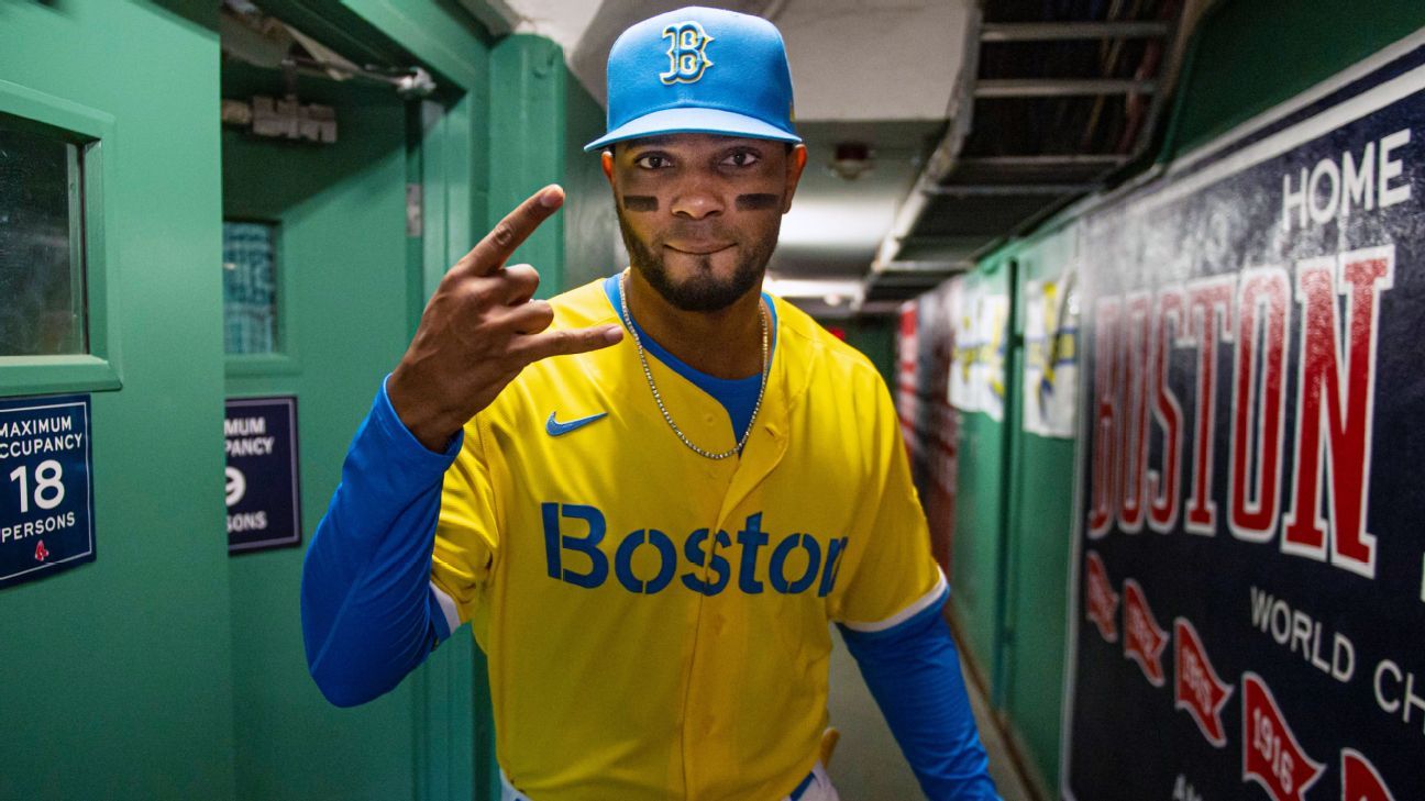
3. Boston Red Sox
Debut: April 17 vs. White Sox
Design inspiration: The Red Sox went with the most radical design among the uniforms released thus far, unveiling the first uniform in team history to feature yellow and blue as the primary colors. On the front of the yellow jersey, there is a blue stenciled font, and the hat is blue. While the team featured blue as a primary color through 1907, the team has primarily sported red since 1908. The Boston Marathon and Patriots’ Day hold a special place in the culture of Boston, and the team decided to pay homage to the city’s unique holiday through its uniforms, highlighted by the 617 marathon bib patch on the left sleeve.
Fan reception: While many traditionalist fans disliked the departure from the team’s classic white and red uniforms, others embraced the design. Although the uniforms received a mixed reception, the Red Sox sold out of the new jerseys and the City Connect merchandise that was released along with them at the Fenway Park team store.
Verdict: We give high marks for boldness and the team’s desire to do something outside of the norm. The City Connect series is not meant to appeal to everyone, and by going with something surprising and outside the box while receiving a relatively positive reception, the Red Sox are pushing forward the idea of what a baseball uniform can look like.
4. Arizona Diamondbacks
Debut: June 18 vs. Dodgers
Design inspiration: The Diamondbacks unveiled a gold uniform referencing the Sonoran Desert and the state’s Hispanic culture, with “Serpientes” across the front. Not straying too far from the team’s existing colors, Arizona decided to flip its primary and secondary colors, making the team’s distinctive Sedona Red color an accent through the numbers. The uniform patch on the left sleeve features the Arizona state flag and a reference to Phoenix’s nickname as the Valley of the Sun.
Fan reception: The Diamondbacks received a largely positive, but less passionate, reaction, with many on social media feeling that the team’s uniform set didn’t do much to differentiate itself from the rest of the series. Some fans enjoyed the more reserved approach to the alternates, while others felt bored by the relatively safe design choices.
Verdict: The decision to use gold as a primary uniform color is what makes Arizona’s foray stick out. While the Diamondbacks certainly did not go as bold as the Red Sox or the Marlins in changing up their look, the decision to use a color normally not seen on a baseball field as a primary makes it more adventurous than the safe design put forth by the Cubs.
5. San Francisco Giants
Debut: July 9 vs. Washington Nationals
Design inspiration: The most unique design elements from the Giants’ uniforms are a nod to the Golden Gate Bridge, silhouetted on the sleeves, and to the San Francisco fog, which dots the team’s logo on the jersey’s chest, the player uniform numbers and the bridge. A small patch above the jersey tag features the Giants lettering surrounded by fog.
Fan reception: Giants fans reacted overwhelmingly negatively, criticizing everything from the elongated “G” to the fog gradient to the shade of orange, which many thought did not match with the team’s existing aesthetic. Even players like pitcher Kevin Gausman expressed a mixed reaction to the jersey, telling reporters, “I think there’s so much more that goes into the city than fog.”
Verdict: The Giants created a uniform that looks different from most today, experimenting with the fog-and-mist gradient. While the simple orange-and-white look feels slightly underwhelming considering some of the bolder color palettes in the City Connect series, the Giants’ uniform seems a bit more timeless compared to the other alternates.
6. Chicago Cubs
Debut: June 12 vs. St. Louis Cardinals
Design inspiration: The Cubs uniforms feature a largely navy blue design with light blue accents meant to evoke the Chicago flag, with “Wrigleyville” across the front in a font similar to the ballpark’s marquee and each of the city’s 77 neighborhoods acknowledged with names on the sleeves of the dugout and bullpen jackets. The jersey’s left sleeve features a patch of the Chicago municipal device logo and a circle with a Y, symbolizing the north, south and main branches of the Chicago River.
Fan reception: The uniforms leaked ahead of their formal reveal and received a largely negative reception from fans, many of whom felt they were boring compared to the rest of the City Connect series, although some appreciated the more toned-down approach.
Verdict: The Cubs took far and away the safest approach to the series so far, which made the new alternates look relatively tame and a tad boring. Overall, the Cubs got outshined by their rivals on the South Side.
7. Los Angeles Dodgers
Debut: Aug. 20 vs. Mets
Design inspiration: The “Los Dodgers” are honoring the 40th anniversary of Fernandomania — the historic 1981 season by pitcher Fernando Valenzuela — in addition to the team’s connection to the Latin community. The team also took inspiration from the murals around Los Angeles, with spray-painted accents on the uniform sleeves.
Fan reception: The Dodgers’ City Connect offering leaked early, and they received a largely negative reaction on social media due to the lack of differentiation from the team’s current uniforms.
Verdict: Given how many consider the Dodgers’ uniforms the most beautiful and timeless in sports, the City Connect alternates fall flat because they did not deviate much from the tried-and-true formula. While every other team took some sort of design leap from their current home and away sets, the Dodgers failed to do so. Even the Cubs, whose uniforms many considered to be too safe, took a bigger risk.